Responsinator -helping users preview the effect of the target website on mobile devices
Tag: Test mobile device
English Websites: http://www.responsinator.com/ Enter The Website
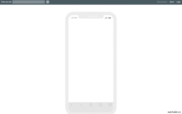
Responsinator is an online tool that helps users preview the effect of the target website on mobile devices.The user does not need to register. It only needs to enter the domain name in the "Enter Your Site" in the upper left corner of the homepage of the website. Then you can see the effect of the website on each device and size.This tool integrates a variety of simulators including iPhone, Android, iPad, and Kindle, which facilitates developers, front -end designers, and webmasters on their real previews. Test the effects of the mobile version of the mobile version on each mobile device.
In addition, Responsinator is still a Chrome extension, which can more conveniently check the response ability of any website.Just click the Responsinator Chrome extended toolbar icon to open a pop -up window containing the response tool, enter the URL of the website to check the response, and then press Enter.This tool allows you to choose the device from the available device list, change the view to the horizontal mode, test it under custom resolution, and test the local custody website.
Overall, Responsinator can help users preview and test the effects on mobile devices easy and conveniently, and can check the response ability of the website. It is a practical online tool.

It is prepared for website manufacturers
Responinator helps website manufacturers quickly understand their response website on the most popular device.It does not replicate its appearance accurately, because accurate testing is always tested on real devices.
We recommend using the Chrome browser on OSX 10.7+, and the scroll bar is set to "rolling" (system first options ›conventional› display rolling bar ›" rolling). This means that the width of the device is not affected by the rolling bar.
Professional tip: Append & Scroll = EXT moves the rolling bar outside the device framework.
What is a response design?
This means designing your website to adapt to the user's viewing environment (mobile phone, tablet, laptop, etc.).It realizes this by using media inquiry and other clever technologies.Eshan Marcart wrote an original article about it, and there is a very convenient book.
Related Suggestion
Rosneft | Russian Oil Company
Rosneft operates in all major oil and gas province...
Reading: 22 2024-11-17
Bandai Nanmeng Palace Entertainment
Bandai Nanmeng Palace provides a variety of entert...
Reading: 25 2024-11-17
US Department of Energy (DOE)
The US Department of Energy (DOE) is one of the mo...
Reading: 19 2024-11-17
undertood it
UNDERSTOODIT has joined EventMobi In the spring of...
Reading: 21 2024-11-17
Referral Rock: Referral Software Done Right -For All
The end -to -end recommendation plan software for...
Reading: 16 2024-11-17


